The Orgitecture logo expresses the brand’s people-first philosophy through a stylized “O” that nods to both human connection and the frameworks that shape strong organizations

The Orgitecture logo expresses the brand’s people-first philosophy through a stylized “O” that nods to both human connection and the frameworks that shape strong organizations
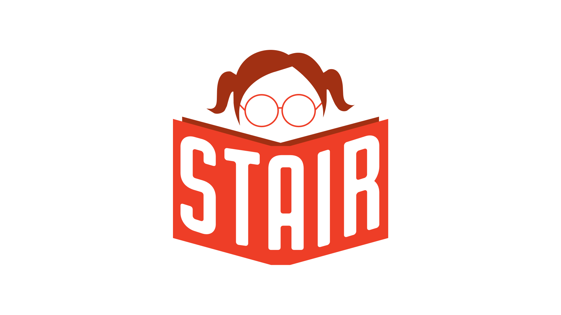
The identity centers on an expressive red-toned illustration of a girl reading, symbolizing imagination, learning, and growth. By placing the nonprofit’s name on the book
For Vest Construction, the logo unites a GPS pin and a home to tell a simple story: they know exactly where home is—and how to