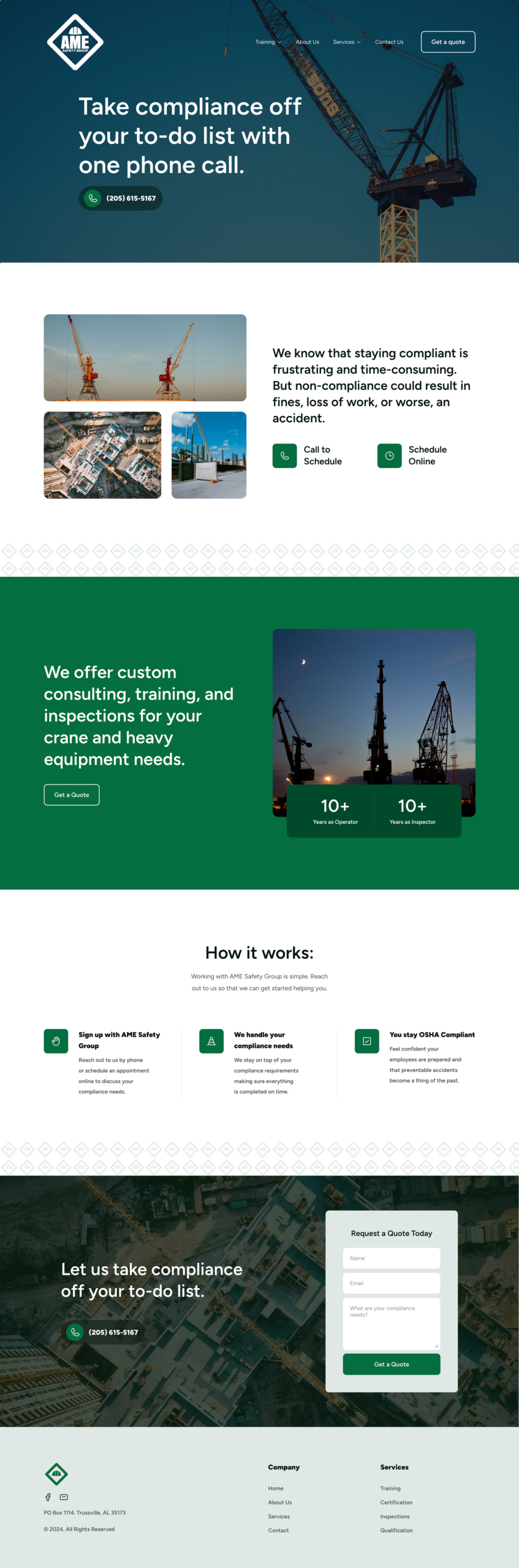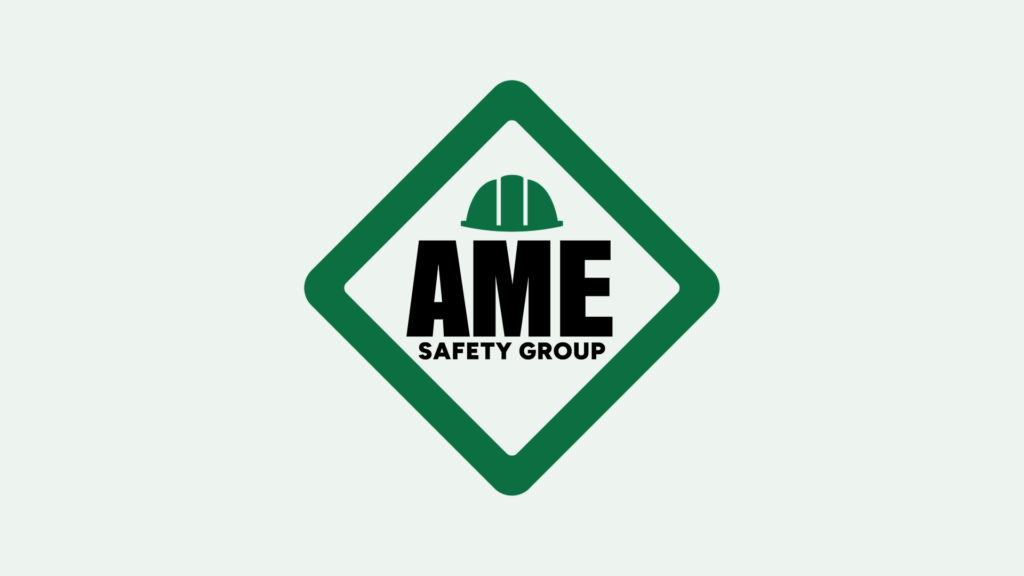
The brand identity for AME Safety Group establishes a confident, modern presence rooted in trust and protection. The visual system balances bold typography, a structured grid, and a focused color palette to convey reliability while remaining approachable. Together, the elements build a cohesive identity that reflects AME’s commitment to safeguarding people, workplaces, and communities.
Deliverables:
- New Mission Statement
- Logo
- Website