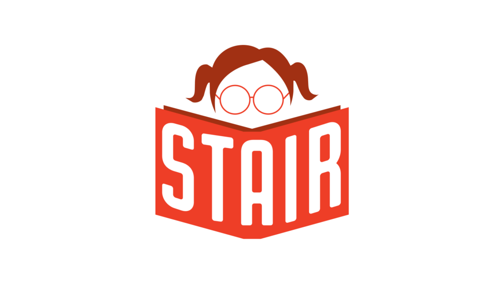
The identity centers on an expressive red-toned illustration of a girl reading, symbolizing imagination, learning, and growth. By placing the nonprofit’s name on the book itself, the logo becomes both narrative and iconic—a simple, memorable mark that reflects the organization’s impact on young readers.